Helium rebrand: New Look, Same Us

At Helium, we’ve had our nose to the grindstone for over 10 years now. Building quality apps for our customers to do better business on Shopify. This past decade hunched over the tool bench helped us hone our craft and grow as a team. We then realized our brand identity needs to grow with us, too.
Since 2015, we’ve learned what’s important to us: we’re makers, craftspeople, curious and cosmic, professional but playful. These are core qualities that our whole team shares, and that ethos needed to be better represented in our visual identity.
Each of our apps have grown too. Each has established their own niche in the marketplace, and that means they need their own personality while also feeling a part of our family. Each app is one of a kind, but we also want them to feel of-one-kind.
All that to say, we’re excited to announce that Helium’s brand is getting a new lease on life. We expanded our color palette, fretted over typefaces, and built out our assets to be more future-facing, creating more space for creative expression. We’ll be rolling out this new look over the coming months, so keep an eye out!
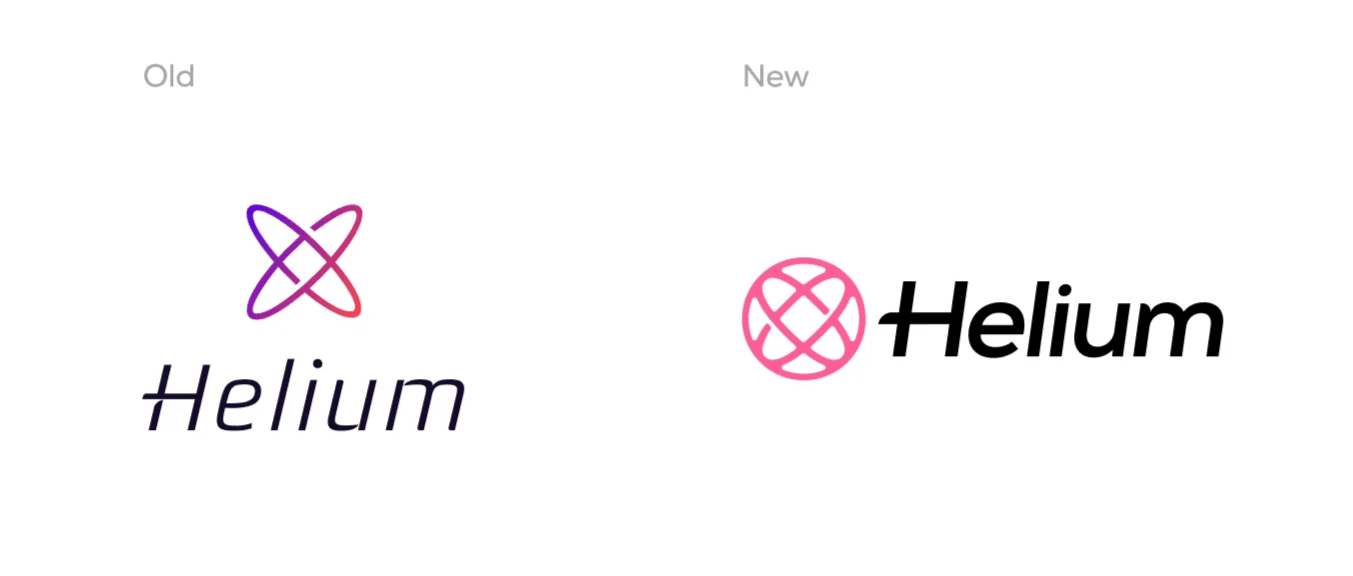
New Logo Who Dis?
We had an identity crisis with our old logo. It was challenging to make it work horizontally; it could feel too thin, and it didn't work well at smaller sizes. But we loved our atom, and that science + space vibe still rings true in our office and culture! So we gave our atom some love. It got a thickness treatment, and we wrapped it with a circle to better articulate an outer boundary.
A logo mark must look good on a pen and the side of a bus. We think our new circular atom will be a great fit for both and anything in between.
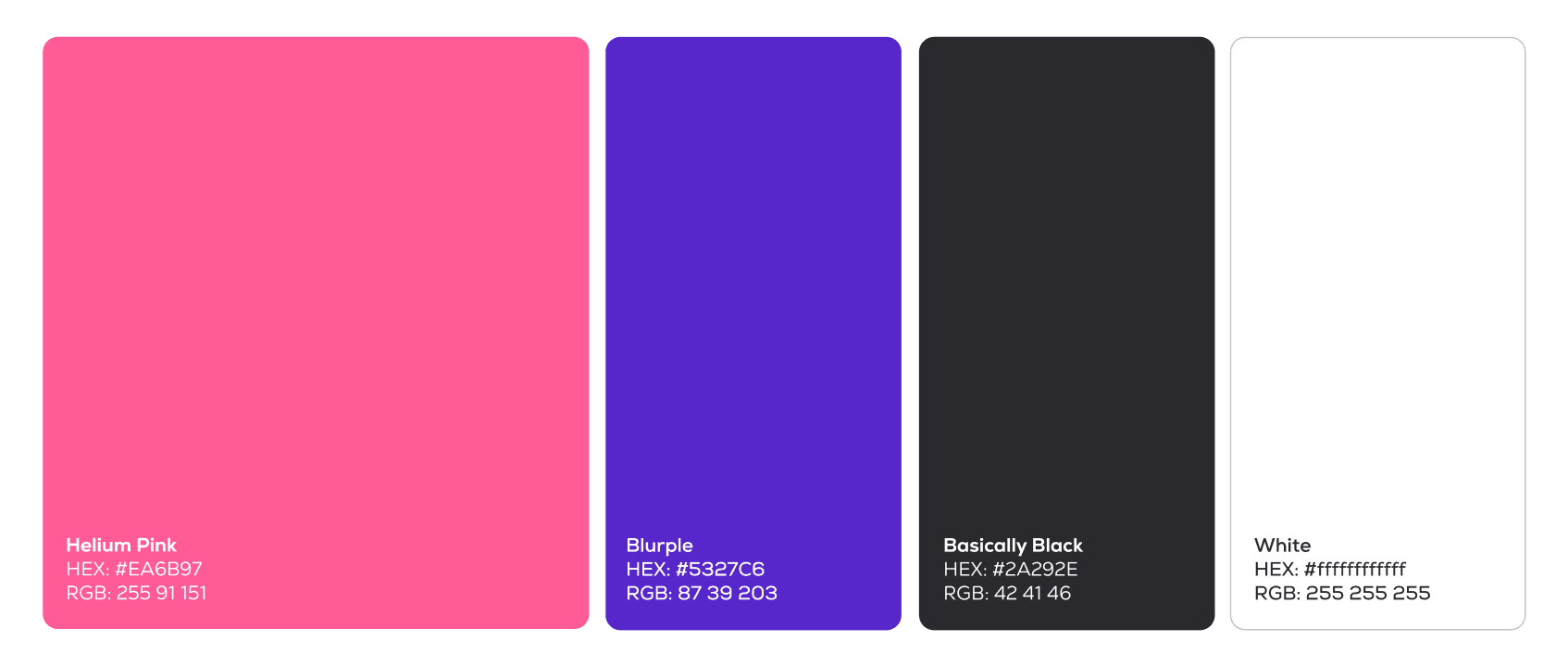
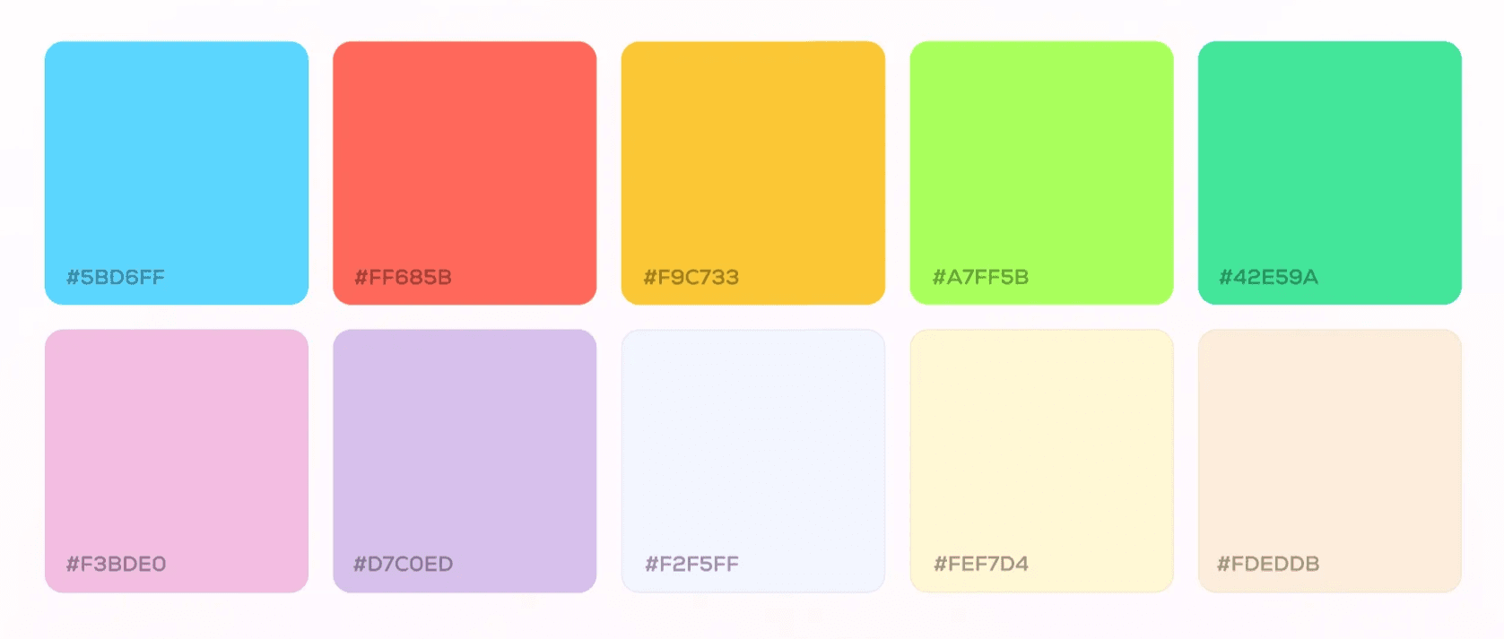
New Colors
Our designers felt stuck with our limited color palette, so this go-round we decided to expand our colors to create more opportunities to change things up or evolve as trends and design preferences shift.
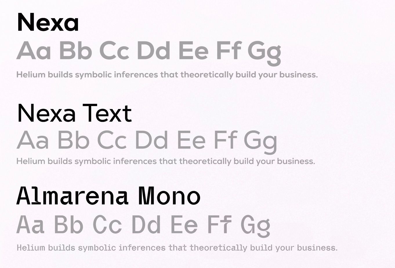
New Font
Quitador, Glober, and Frutiger have been our daily driver typefaces for eons, and they all still hold up very well. But it’s time for a change. Like replacing a beloved car for something a little more sleek and adventurous, Nexa and Nexa Text will be our main squeeze. We also added Almarena Mono to add some pop and flair to our visuals.
Get it while it’s hot!
If you’re a partner, we would love it if you’d use our new identity moving forward.